The following Figure 1 is the death toll by country after the 2004 Indian Ocean Tsunami disaster.
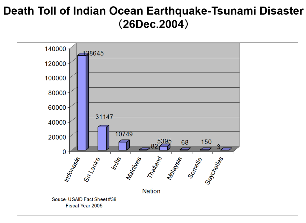
Figure 1 Death toll by country
Then Table 1 indicates the death toll flow of each country.
What can we say about this?
Table 1 The Death Toll Flow
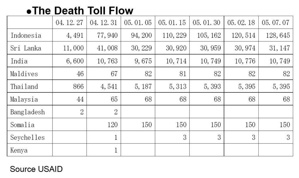
As you can see Table 1, the number of victims (deaths) is changing day by day. For instance, the number of deaths reported in Indonesia from 05.01.15 to 05.01.30 is decreasing. The death toll flow of Somaria looks somehow strange. If we can consider these kinds of views, we can understand that the reported death numbers reflect the social situations of the country. These views will be discussed later.
Next, Figure 2 shows the picture taken at the tsunami memorial meeting in Phang Nga province one year after the disaster. This definitely indicates so many foreigners were killed by the tsunami. Figure 3 support this fact. This is because the affected areas were sightseeing spots. Even Thai victims include so many visitors from all over the country.

Figure 2 The Picture of the Tsunami Memorial Board
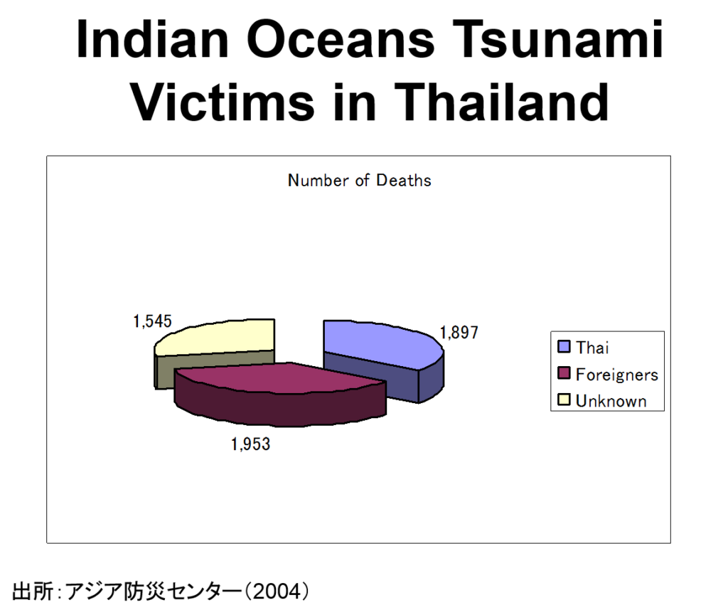
Figure 3 Indian Oceans Tsunami Victims in Thailand
The victim’s nationality is so diverse.Figure 4 indicates the top 10 deadliest disasters (actually top 6 exist) in Sweden and you can know the Indian ocean tsunami is ironically the worst natural disaster in the history of Sweden (The fatality number is 543 Wikipedia).
Figure 4 Deadliest Disasters in Sweden (1900-2014) Source: EM-DAT
[ad#ads1]
![Day_9 : 臨床現場即時検査:POCT [Japanese]](https://disasterresearchnotes.site/wp-content/plugins/wordpress-23-related-posts-plugin/static/thumbs/26.jpg)